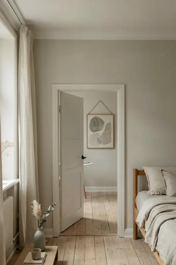
I spent months staring at a blank wall in my living room, wanting something that felt calm without being boring. I tried a cluster of small frames, but it looked like a messy Pinterest board. Then I stumbled onto a large, textured leaf panel and everything clicked. That single piece of green leaf wall art became the anchor of the whole room. It brought in the quiet, grounded feeling I could not get from a poster or a shelf. Here is what I learned about making that kind of statement work, without overthinking it.
Why a Large Leaf Panel Beats a Gallery Wall (For Me)
Gallery walls look great in photos, but I found them exhausting to plan. You have to match frames, balance sizes, and leave enough negative space. One large leaf panel solved all of that in five minutes. It covers a good area with a single focal point, and your eye knows exactly where to rest. The trick is to pick a panel that is at least 24 inches wide if your wall is average sized. Anything smaller risks looking like an afterthought.
I chose a piece made from pressed natural leaves on a wood backing. It has visible veins and slight color variation, so it does not scream “printed fabric.” That texture makes people stop and look closer, which is exactly what you want from statement wall decor. If you are short on patience or time, one big botanical piece skips the hassle and still feels curated.
Choosing the Right Shade of Green for Your Space
Not all greens work in every room. I learned that the hard way when I first ordered a bright lime panel that clashed with my beige sofa. The green I ended up with is a deep olive, almost muted, with hints of sage. It sits back a little and lets the room breathe. For a bedroom, you might want a cooler green with blue undertones, like eucalyptus, to keep the vibe restful. For a living room that gets afternoon sun, a warmer green with yellow undertones can glow without feeling neon.
The best way to test is to look at the panel in the light where it will hang. Hold it up at different times of day. If you are buying online, look for photos that show the piece in both bright and dim settings. I also moved my panel around the house before committing to a spot. It ended up in a corner that gets morning light, and the leaves catch a soft shadow that changes through the day.
How to Style Green Leaf Wall Art with Neutral Tones
My living room is mostly white walls, a tan linen sofa, and a oak coffee table. The leaf panel sits above a low console table. I kept everything else around it simple because the panel is already busy in a good way. Here is what worked for me:
- Added a cream throw blanket on the sofa to echo the neutral background of the leaf art.
- Placed a single ceramic vase in a warm stone color on the console, no flowers needed.
- Left the wall space around the panel empty for about 12 inches on each side to let it breathe.
- Used a natural jute rug on the floor to tie the organic feel together.
The mistake I made at first was adding a second frame nearby. It competed with the leaf panel and made the wall feel cluttered. One strong piece, surrounded by quiet neutrals, feels more intentional. Think of the leaf as the main character and everything else as the supporting cast.
The Texture Factor: What Makes This Piece Feel Real
A flat print of a leaf does not hit the same way. The piece I love most has actual depth. The leaves are pressed and then layered, so some parts raise up a quarter inch from the backing. When the light hits from the side, those shadows turn the wall into a little landscape. That texture is what makes it botanical art instead of just a decoration.
If you are shopping, look for words like “handcrafted,” “pressed leaf,” or “3D panel.” Avoid anything described as “canvas print” if you want that organic feel. I also saw some metal cutout leaf shapes that cast their own shadows on the wall. Those work too, just make sure the metal is matte finished so it does not glare. Real texture gives your brain something to explore, and that keeps the wall interesting month after month.
Three Lessons I Learned Hanging Accent Wall Decor
I hung my first leaf panel too high. I thought “center at eye level” meant the top of the piece at eye level. Actually, the center of the art should be around 57 to 60 inches from the floor. I had to rehang it twice before it looked right. Second, I used a heavy duty adhesive strip rated for 20 pounds, because the wood backing is heavier than it looks. Nails work too, but I did not want holes in my rented wall. Third, I left the panel leaning against the wall for two days
#greenleafwallart #statementwalldecor #natureinspiredhome #livingroomaccentwall #botanicalart
Leave a Comment