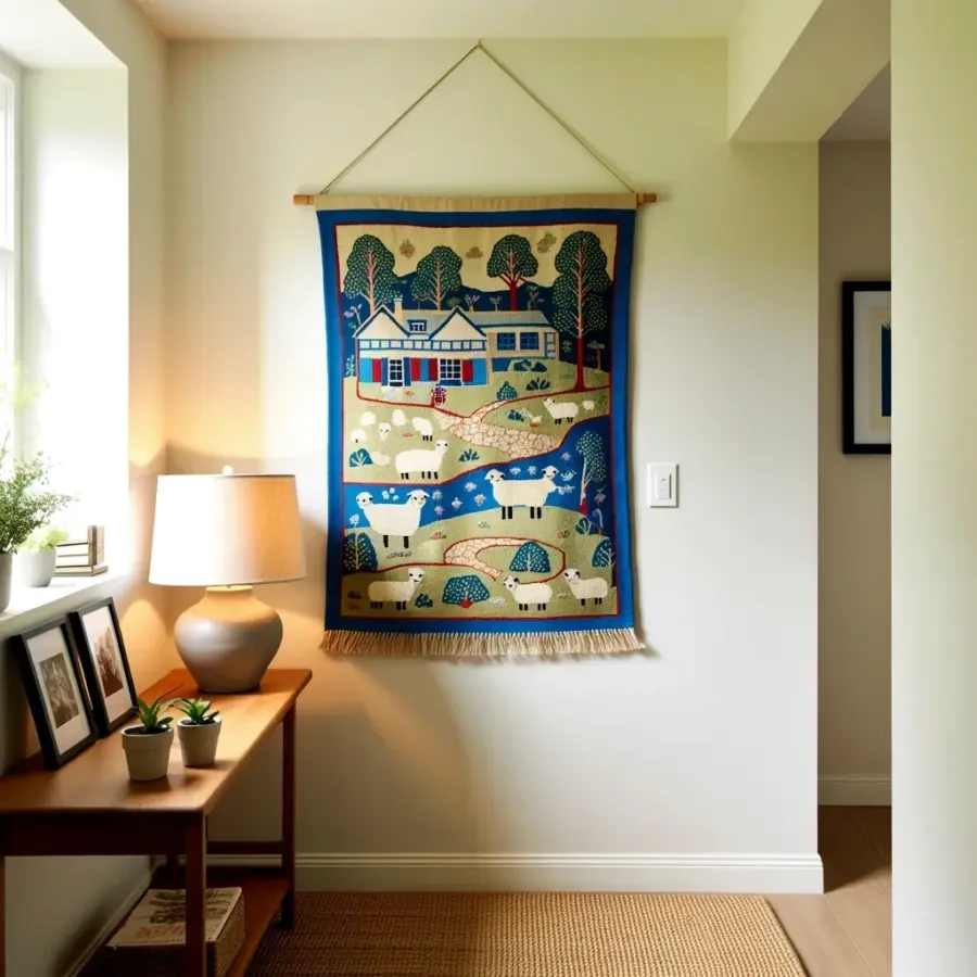
My living room wall sat blank for months. Not because I lacked art, but because I was terrified of committing to a layout and then living with a wall full of nail holes that proved I’d gotten it wrong. Every piece of wall decor living room inspiration I saved looked effortless, but my arms crossed, skeptical, believing those perfectly styled rooms came from some innate design gene I simply didn’t possess. It turns out, I was overthinking it. The solution came from a roll of kraft paper, a roll of painter’s tape, and a willingness to treat my wall like a temporary canvas. This is the exact method that finally got my statement art hung, measured, and looking like I actually knew what I was doing.
Choosing Your Statement Art Piece First
Before you touch a hammer, you have to decide what deserves the spotlight. Statement art isn’t just a pretty picture; it is the focal point that anchors the entire room’s mood. For my space, I chose a large abstract piece with earthy terracotta tones that pulled out the warm hints in my sofa. It was bold enough to start a conversation but neutral enough to work with future decor changes.
Do not fall into the trap of buying a piece just because it is on sale. Walk through your home, look at the existing furniture, and note the colors or textures you want to highlight. You are looking for a piece that makes you stop scrolling when you see it online or makes you walk back to it in a store. If it doesn’t give you that gut feeling, keep looking.
Consider the scale. A common mistake is hanging a piece that is too small for the wall, leaving it looking lost and insignificant. A good rule of thumb is that your art should take up roughly two-thirds to three-quarters of the width of your sofa or the empty wall space you are filling. Measure that space with a tape measure and take those dimensions with you when you shop.
The Kraft Paper Trick That Saves Your Walls
This is the game-changer that eliminated all my guesswork. Instead of holding the heavy frame up against the wall and trying to visualize it, I traced the outline of my art onto a large sheet of kraft paper. I used a pencil to mark the exact dimensions of the frame, including the top, bottom, and sides. Then, I cut the paper to size with a pair of scissors.
Next, I taped the paper cutout to the wall using painter’s tape. This is where the magic happens. I could now slide the paper left, right, up, and down without lifting a single heavy object. I walked back and forth, sat on my sofa, and even stood in the doorway to see how the layout felt from different angles. This visual testing phase is crucial because it lets your eye adjust without any physical commitment.
Once I was happy with the paper’s position, I traced the corners of the paper lightly with a pencil. This gave me a perfect reference point for where the frame would go. It also meant that when I removed the paper, I had a clear, faint outline on the wall to guide me. Zero extra nail holes were made because I didn’t have to guess, miss, and re-drill. It took twenty minutes of moving paper around, but it saved me an afternoon of patching spackle.
Hanging Art at the Perfect Height (57 Inches)
You have probably heard the gallery standard of hanging art at eye level, but that phrase is ambiguous depending on who is looking. The professional secret is to hang the center of the artwork at 57 inches from the floor. This measurement aligns with the average human eye level, creating a natural and comfortable sightline for most people standing or walking through the room. It feels right because it is right.
To apply this, I measured up from the floor to the 57-inch mark on the wall and made a tiny pencil dot. Then, I measured the height of my art and divided it by two to find the center. From there, I measured the distance from the top of the frame to the hanging wire when it was pulled taut (this is important, as a loose wire will make the art hang lower). I added those two numbers together and used that final calculation to move my pencil reference dot down from the 57-inch center point.
This method is not just for living rooms. I have used it in my hallway and bedroom, and it always creates a cohesive, professional look. Trust the math. It is far more reliable than eyeballing it and hoping for the best. Even when I am sitting, the art feels connected to the room, not floating awkwardly in space.
How to Arrange a Gallery Wall Layout
If you are hanging a single piece, the kraft paper trick is all you need. But if you are building a gallery wall, you need a slightly different approach to the layout. I wanted a mix of frames around my statement art, so I traced each individual frame onto separate pieces of paper. I labeled each piece with the name of the art that would go there in pencil.
Then came the puzzle phase. I taped all the paper cutouts to the wall, starting with the largest central piece. I arranged the smaller ones around it, playing with spacing until it felt balanced. I kept a consistent gap of about two to three inches between each frame. This consistency is what makes a gallery wall look intentional rather than chaotic.
Here are a few things I kept in mind while arranging the layout:
- Visual weight: Put larger or darker frames closer to the center or bottom to ground the composition.
- Spacing: Keep equal gaps between all frames to create a unified grid or a relaxed organic flow.
- Color harmony: Mix frame colors, but make sure they all work with the room’s palette to avoid visual chaos.
- Edit ruthlessly: If a piece feels off-balance, remove it. Less is often more when creating a focal point.
Once the cutouts looked perfect, I marked the top corner of each paper with a pencil. I then removed the papers and used those marks to hang the real frames one by one. The whole process felt methodical, but the result was a wall that looked like it had been curated over years, not assembled in an afternoon.
Tools You Need for a Smooth DIY Art Installation
Having the right tools makes the job infinitely easier. You do not need a professional toolbox, but a few basics will prevent frustration. I gathered my supplies before I started, so I did not have to pause mid-project to search for a screwdriver. Preparation is half the battle.
Grab a measuring tape, a pencil, a level, painter’s tape, and a hammer. You will also need picture hanging hooks that are rated for the weight of your frame. Heavy pieces require wall anchors, especially if you are hanging them on drywall without hitting a stud. Check the back of your frame for the hanging hardware and ensure it is secure before you lift it onto the wall.
Do not underestimate the power of a laser level. While a small spirit level works fine for a single frame, a laser level is fantastic for aligning multiple frames in a row. It projects a straight line across the wall, taking the guesswork out of keeping everything level. If you do not have one, a simple chalk line or a long straight edge can work in a pinch.
Final Adjustments and Styling Touches
After the art is securely on the wall, step back and look at it from different spots in the room. Sometimes, a frame will look slightly crooked or the spacing will feel tighter on one side than the other. This is your moment to make those tiny adjustments. Loosen the wire slightly, shift the frame a millimeter, and step away again. The eye is remarkably good at catching a crooked line, so take the time to correct it.
Consider the style around your statement art. I added a small table lamp below my piece to cast a warm glow on the canvas in the evening. A trailing plant on a nearby shelf also helped soften the edges and bring life to the composition. These are the finishing touches that make the wall feel fully integrated into the room, not just stuck on the wall.
I recommend taking a photo of your finished space. Looking at a photograph helps you see the room with fresh eyes and often reveals issues you missed in person. When I did this, I noticed I had hung my print a little too close to the window, so I shifted it over by two inches. The photo was the objective opinion I needed to call the project done.
When to Break the Rules of Hanging Art
While the 57-inch standard is a reliable starting point, your room might demand something different. If you are hanging art above a tall piece of furniture, you should adjust the height so the art does not hover too high. The bottom edge of the frame should generally sit between 6 and 12 inches above the top of the furniture to keep the visual connection strong. This creates a cohesive look where the furniture and art feel like one unit.
In a room with high ceilings, you might find that centering the art at 57 inches makes it feel too low and disconnected. In that case, you can raise the center point slightly to balance the vertical space. The invisible rule is that art should relate to the furniture below it and the ceiling above it. Your eye should travel naturally between them without a jarring disconnect.
For large, oversized pieces that rest on the floor, always trust the instinct of your room’s architecture. The best layout is the one that makes you feel calm and comfortable when you walk in. If you are constantly thinking something looks off, it probably is. Move it until your eye rests easily. This is your home, and your comfort is the ultimate guide.
Hanging statement art does not have to be a stressful gamble. With a roll of kraft paper and a tape measure, you can completely eliminate the guesswork and anxiety of making permanent holes in your walls. The process is slow at first, but it is incredibly satisfying to stand back and know that every frame is exactly where it should be. I hope this method helps you finally get that beautiful piece out of the corner and onto the wall where it belongs.
Have you tried the kraft paper trick before, or do you have a different method that works for you? I would love to hear how your living room wall decor turned out, so feel free to share your wins (and your lessons learned) in the comments.
Leave a Comment