Why a Staircase Gallery Wall Felt Daunting at First
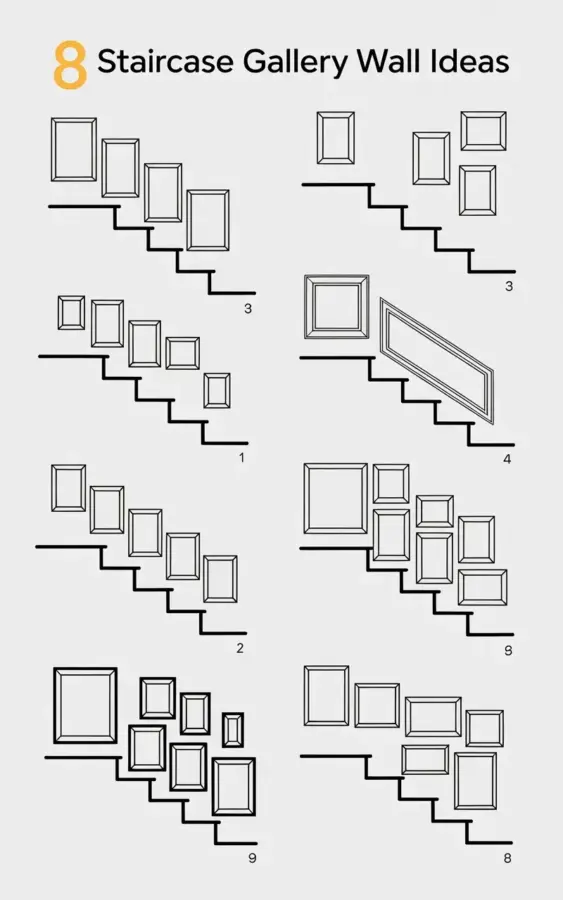
When I first decided to tackle a staircase gallery wall in my own hallway, I was paralyzed by choice. There are so many layout ideas online, but most of them feel too polished or require you to buy a custom template. I wanted something simple, something I could sketch out with a pencil and a ruler. That’s when I stumbled across a minimalist line drawing that showed exactly eight different frame arrangements marching up a diagonal line. The illustration had the title “8 STAIRCASE GALLERY WALL IDEAS” with the “8” in yellow and the rest in black. It clicked instantly: you don’t need a complicated formula. You just need to pick a layout that follows the natural angle of your stairs. In this post, I’ll walk you through those eight arrangements and share what actually worked when I tested them in my own home.
Start With the Angle: How to Map Your Stairs for Any Arrangement
Before you buy a single frame, take a piece of painter’s tape and mark the slant of your staircase on the wall. I used a level and a long strip of blue tape to mimic the stair line from the bottom tread to the top landing. This single step saved me from crooked frames and wasted holes. Most of the eight sketches in that illustration use that diagonal line as a guide for the centre or bottom edge of each frame. Whether you go with a single large piece or a cluster of small squares, the secret is to keep the frames parallel to that tape line. It sounds obvious, but I’ve seen plenty of gallery walls that ignore the stairs and end up looking like a chaotic jumble.
One trick I learned: stand at the bottom of the stairs and look up. Your eye naturally follows the flow of the steps. If your frames break that line, the whole arrangement feels off. So, map it first, then choose your layout.
The Single Large Frame: A Bold Statement That Instantly Fills the Wall
Arrangement number one in that sketch is a single oversized rectangle placed smack in the middle of the stair run. I tried this with a 24×36 inch print, and it worked beautifully for a narrow hallway where clutter is the enemy. The key is to pick a piece that has strong contrast or a simple subject (think black and white photography or a single line art print). Because the frame is large, you don’t need anything else to distract the eye. Just nail it so its bottom edge follows your painter’s tape line and you’re done in ten minutes.
One practical detail: use a heavy-duty picture hanger rated for at least 30 pounds. A single large frame can be surprisingly heavy, and drywall anchors are your friend. I learned that after my first attempt almost took out a chunk of plaster.
Symmetrical Grids: Clean and Predictable, But Not Boring
The illustration shows a few arrangements with identical frames stacked in a grid that ascends with the stairs. I tested a 2×2 grid (four square frames, each 11×14 inches) and spaced them about 3 inches apart. Because the grid is symmetrical, it creates a calming rhythm that matches the repetitive nature of stair treads. This layout works especially well in modern or minimalist homes where you want order without sacrificing personality. I filled mine with family photos in black and white matting, and the uniformity let the subjects stand out.
Be warned: measuring a grid on a slope is trickier than on a flat wall. I used a laser level to make sure each frame’s top edge aligned with the imaginary diagonal line. If you don’t have a laser level, a long carpenter’s level will do. Trace a light pencil line so you can erase it later.
Asymmetrical Clusters: Let Go of Perfection for a Collected Look
Several of the sketches show clusters of different sized frames huddled together at varying heights. This was the arrangement I was most nervous about because I hate guessing. But it turned out to be the most forgiving. I grouped a large 16×20 frame with two smaller 8x10s and a 5×7, making sure the outer edges loosely followed the stair line. The key is to keep the visual weight balanced: put the largest frame close to the centre of the group, then tuck smaller ones around it. You don’t need every frame to be perfectly aligned; a little offset adds character.
If you want to recreate the sketched look, lay the frames on the floor first and arrange them until the composition feels right. Then transfer that layout to the wall using paper templates taped in place. This saved me from making extra holes.
Matching Frame Sizes in a Linear Row: The Easiest Way to Look Intentional
Another arrangement in the illustration is a straight line of identical square or rectangular frames climbing the wall alongside the steps. This is the simplest of all: choose three to five frames of the same size, space them equally (I used 6 inches between each), and hang them so their bottom edges sit on your tape line. Because everything matches, the eye slides right up the staircase without stopping. I used simple black frames for a cohesive look, but white or natural wood would work just as well.
One thing the sketch doesn’t show: consider the gap between the frame and the stair tread. I left about 8 inches from the top of the handrail to the bottom of the first frame. That gave the wall room to breathe without feeling cramped.
Mixing Landscape and Portrait Orientations for Visual Variety
In the sketches, you can see arrangements where landscape rectangles sit next to portrait ones. I tried a group of three: a landscape 16×20 at the bottom, a portrait 11×14 in the middle, and another landscape 12×16 at the top. The mix broke up the monotony and let me use different types of art (a landscape photo, a portrait of the family, and a travel poster). The rule I followed: align the centres of the frames with the stair diagonal, not the edges. This prevented the tops and bottoms from drifting off course.
A practical tip: use the same matting style across all orientations. I stuck with white mats and black frames, which unified the mismatch. It’s a cheap trick that makes a mixed collection look curated, not accidental.
Shelf-Based Gallery Walls: No Nails, No Regrets
While the illustration mostly shows hung frames, one arrangement reminded me of a picture ledge system. Instead of nailing every frame, I installed a long floating shelf that followed the stair angle. Then I leaned a mix of small and medium frames against the wall on the shelf. This was a lifesaver for renters or anyone afraid of committing to multiple holes. You can swap out the art whenever you want, and the shelf itself becomes part of the decor. I added a small plant and a ceramic vase to break up the rectangles.
If you go this route, choose a shelf that’s at least 6 inches deep so the frames don’t tip over. I also added little rubber bumpers on the back of each frame to stop them from sliding. It’s not in the sketch, but it’s one of the most practical staircase gallery wall ideas I’ve tried.
Tips for Spacing and Leveling: What the Sketch Doesn’t Tell You
The minimalist drawing gives you the big picture, but it leaves out the nitty gritty. Here’s what I learned from hanging all eight arrangements (yes, I tried them all over a weekend):
- Keep a consistent gap between frames within each arrangement. I used 3 to 4 inches for clusters, and 5 to 6 inches for linear rows.
- Use a laser level or a long straightedge to maintain your diagonal line. Even a 1 degree tilt becomes obvious when you walk up the stairs.
- Hang the first frame at eye level from the bottom step, then work your way up. That anchor point makes everything else easier.
- Take a photo of your paper templates from the bottom of the stairs before you drill. It helps you catch spacing errors early.
I also recommend buying a pack of adhesive wall hooks if you’re unsure about positioning. They hold lightweight frames temporarily while you step back and evaluate. Once you’re happy, replace them with nails.
Conclusion: Pick One Layout and Start Hanging
That yellow “8” in the sketch reminded me that you don’t need a hundred options. You just need a handful of solid layouts that respect the angle of your stairs. Whether you choose a single bold frame, a tidy grid, or a casual cluster, the best staircase gallery wall is the one you actually hang. I started with the symmetrical grid because it felt safe, and within an hour my hallway had a focal point that made me smile every time I walked past. Now it’s your turn. Grab a pencil, trace your stair line, and try one of these arrangements. You can always rearrange later – that’s the fun part.
#staircasegallerywall #gallerywalllayouts #stairwaydecor #homedecorideas #wallartarrangement
Leave a Comment